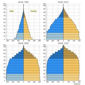
This chart, from the United Nations Department of Economic and Social Affairs, shows standard population pyramids for the world for 1950 and 2010, with projections for 2050 and 2100. Men are on the left, women are on the right. This gives some clues about what the economy will look like in the next 90 years.
1950 was probably the last year of a “normal” population distribution. Effective contraception was not yet widely available, and the revolutions in health care, agriculture, and sanitation that have extended our lives did not touch most of the world.
In 2010, we live in a world with more control over fertility and huge advances in technology that have extended our lives. We have more old people, but also more people in total. By 2100, we have a world with fewer young people relative to the middle and the old.
The distribution of the world’s people looks different now, and that is going to affect everything. The huge increase in the working population – those between age 15 and 65 – means that the world will see huge advances in productivity. They won’t be enjoyed everywhere, though.
These charts show why this time is different.


