I spent a lot of time last week pulling up charts on income inequality in the U.S. to use in class.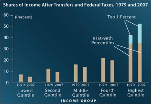 This chart is from the Congressional Budget Office and shows the difference in income distribution between 1979 and 2007. It doesn’t look good, and that was before the recession.
The interesting thing is that there is a ton of data out there, but it seems to be hidden behind all of the many commentaries, blog posts, and articles from publications on the left and the right about the problem.
A little inequality is good: it inspires people to push for more. A lot is bad: it leads to a skewed economy, an us-versus-them politics, and tension.
I have nothing more to say, because the chart speaks for itself.