 Last week, I spoke at FinCon, a conference for people who work in personal finance. My presentation was on Generation X and retirement, and I included a spiffy population pyramid showing that the generation is smaller than the age cohorts born before and after. And to my surprise, very few people in the audience were familiar with population pyramids, despite the fact that they are among the coolest data visualizations out there.
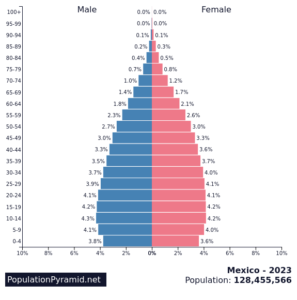
A population pyramid from the current US census is on the right. The Y axis is age, in 5 year increments from 100+ to 0 (birth). Each bar shows the number of people in each age cohort as a percentage of the total population, with the X axis divided by the sex binary. You can see the relative size of each group, the distribution of the population by age, and the division between male and female.
When you compare population pyramids from different countries, you can see differences that translate into real economic and cultural effects. Here, for example, is China.  You can see the larger male population, the effects of the one-child policy, and the government’s inability to reverse it).
For an interesting contrast, check out Mexico.  Its population shows a more normal birthrate (ie, steadily increasing) until recent years.
You can go to the PopulationPyramids.net site and play around; it’s fascinating to compare the differences among countries and think about why these differences occur and what they might mean.


